2 weeks
Austin Food + Wine Festival wants to include more information about their partner, Austin Food + Wine Alliance, on their website to bring more awareness to the local businesses it serves. The website also has some challenges when viewed on a mobile device. They would like to incorporate their client’s needs into the website.
There is a creative way to incorporate the Alliance that makes it fun and accessible to the public, who will in turn support the non-profit.
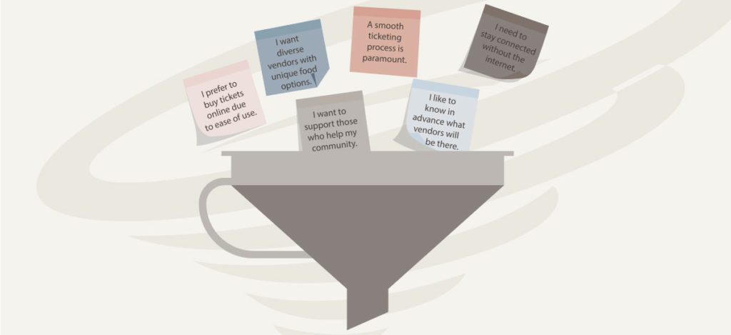
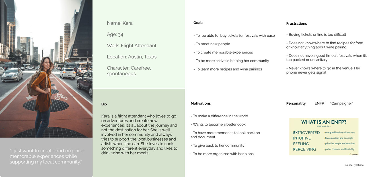
After interviewing 7 festival foodies, we synthesized all of the interview data through affinity mapping as a team. We looked for patterns and found 6 common wants and needs. Next, all of the social media praises and complaints were logged in a pros/cons list. Armed with both of these sets of data, a persona was created. The below list of wants was considered when ideating upgrades to the site.

Competitors use a ‘Nostalgia’ menu option to invite their guests to post photos.
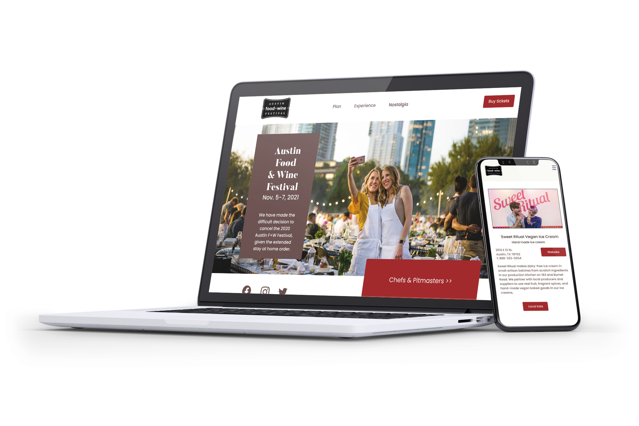
I performed a competitive analysis of other food festivals as well as two mainstream festivals, Coachella and EDC. I crossed referenced website features as well as the information architecture. One of the user’s desires was to be able to document their festival experience. We noticed that Coachella had a ‘documentation’ page on their site and this inspired us to have a ‘nostalgia’ page where people could upload their photos from the festival in an Instagram feed. This would also entice users to access the site after the festival.
Observation: All of the competitor’s website use different menu names for similar pages.
I noticed on the cross-reference that there were several different category names for the same information. On some sites, the Q&A festival facts were labeled under headings including info, rules, and faqs. The discrepancy led me to put together a card sort in order to gain more clarity on menu labels.
After performing the closed card sort we were no further along, as many of the participants used all of the categories instead of selecting just one.
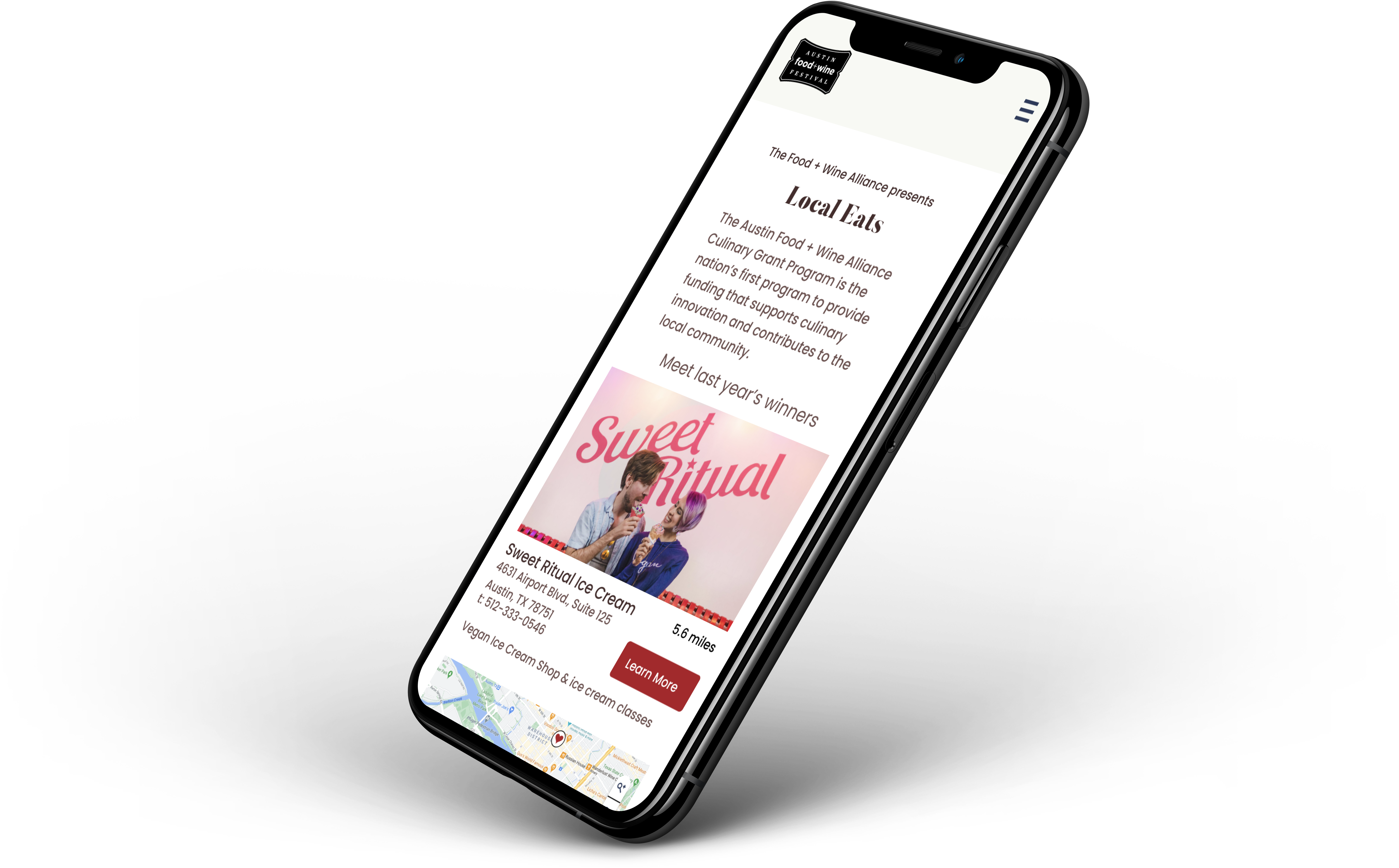
After sorting through the recipient winners, I noticed that there were 2 categories. The first were winners that had physical restaurants or stores that people could visit. The second were services or offered tours. Those we labeled community resources.
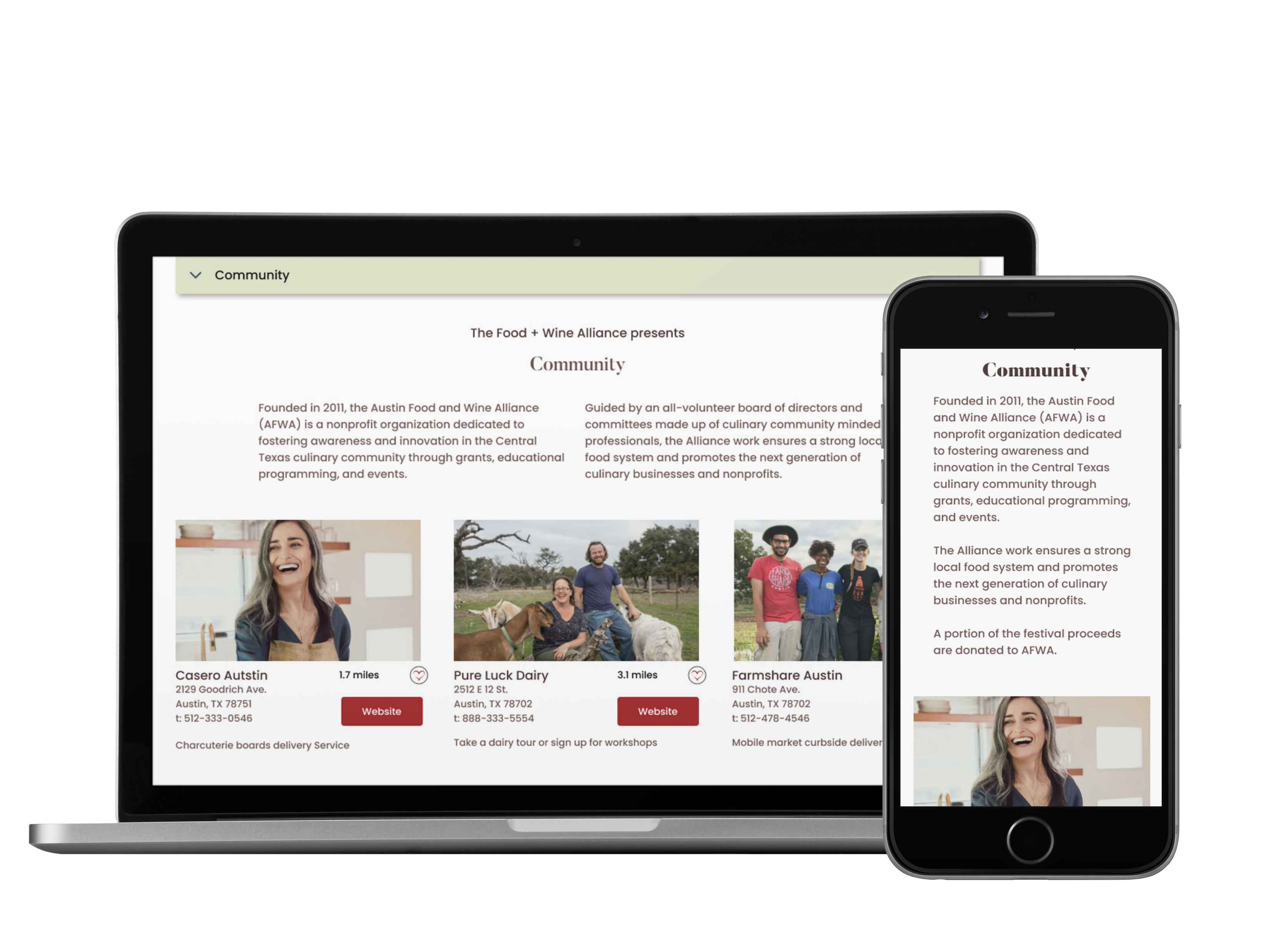
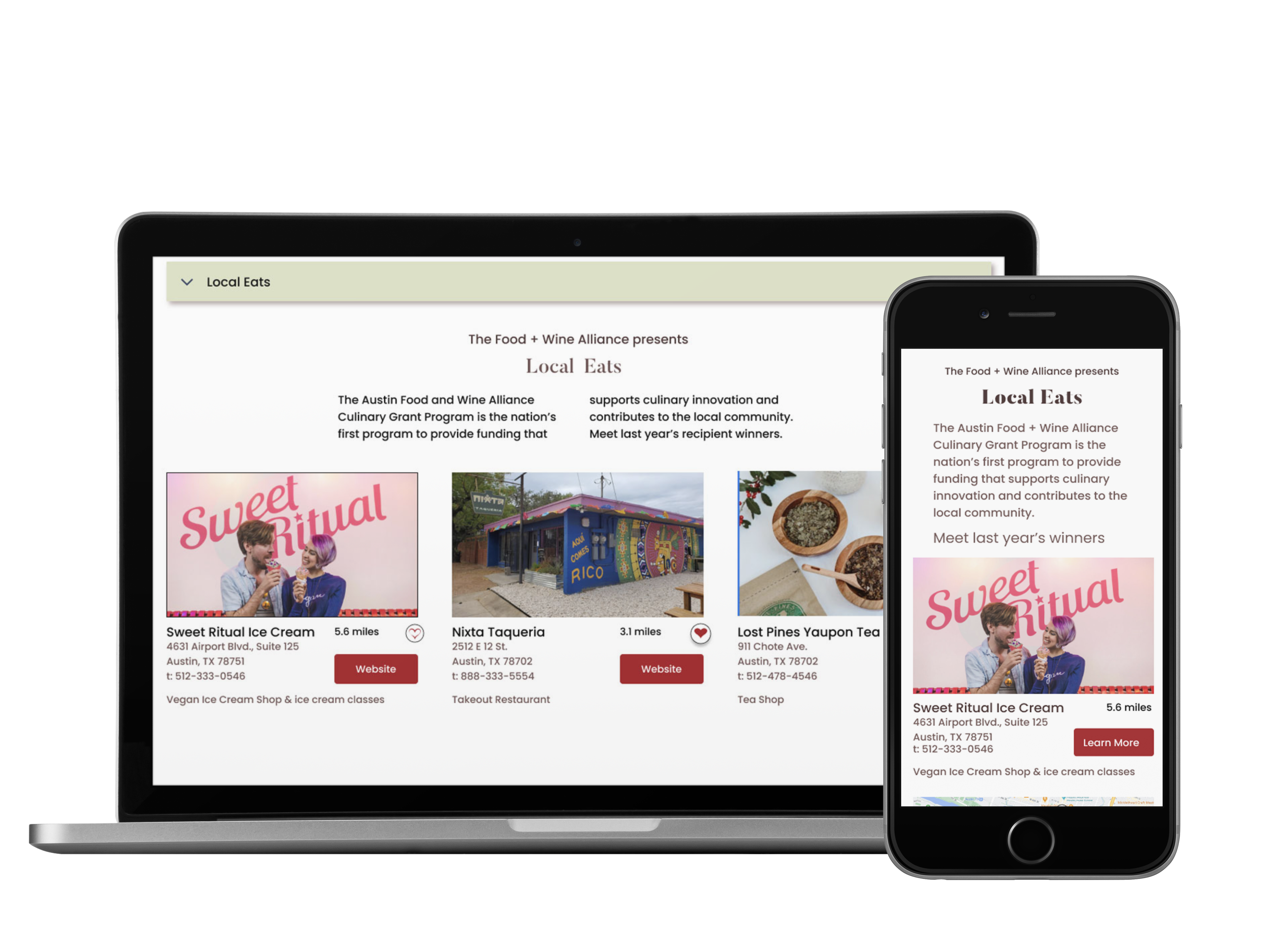
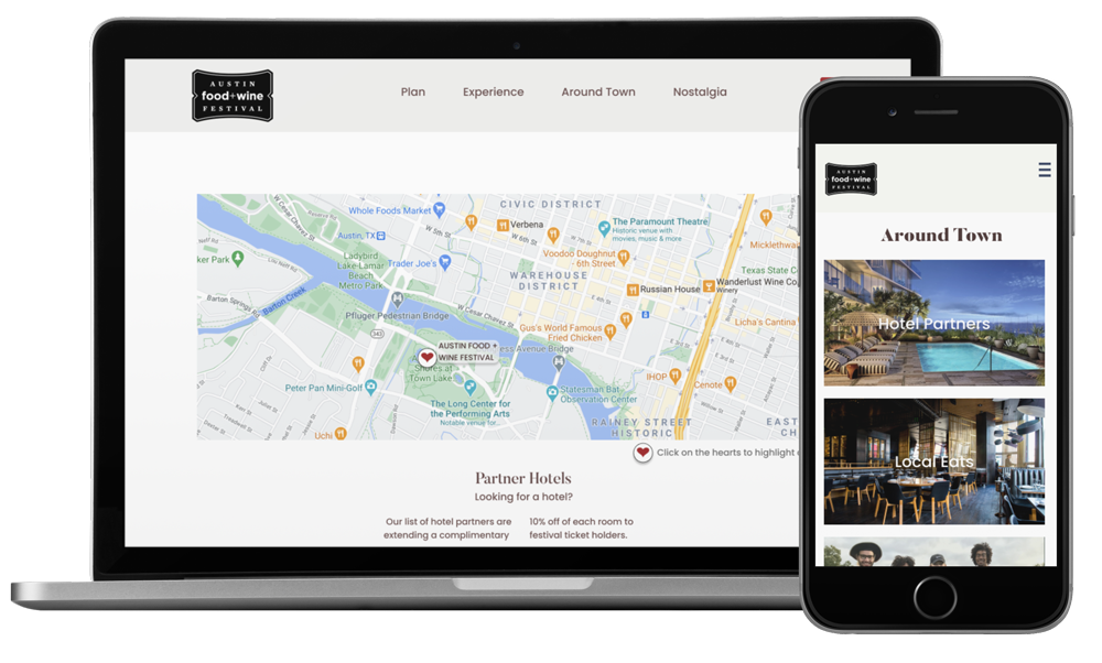
Sorting the alliance into two categories, local eats and community.

On the desktop, you can research the chef’s that you would like to visit. Select the Chefs that you like to add to your personalized schedule. Then send it to your phone as an attachment for easy access later.

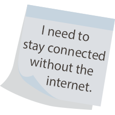
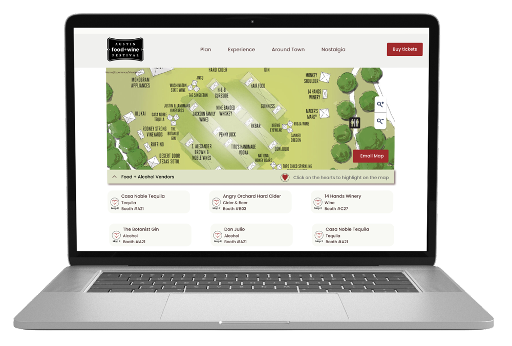
The users expressed that the internet connection at festivals is often terrible. To solve this, my team and I agreed that the user needed a way to download and store the map on their mobile device. Since the desktop was primarily used for research, the User could customize their map there, with the locations and vendors that they wanted, and then email a .pdf to themselves, which they would then open and save on their phone before they left for the festival. In a time-boxed quick sketch exercise, I added the CTA for the map download on the front page for easy access on mobile. This way if they remembered in the car on the way over, they would still have time to download it to their phone.

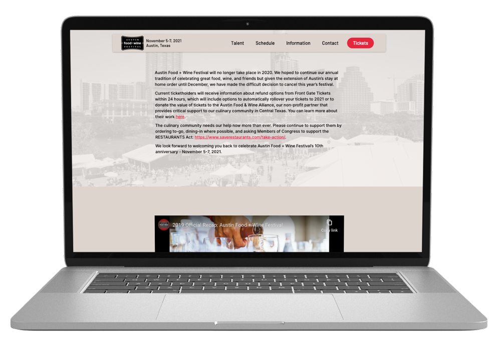
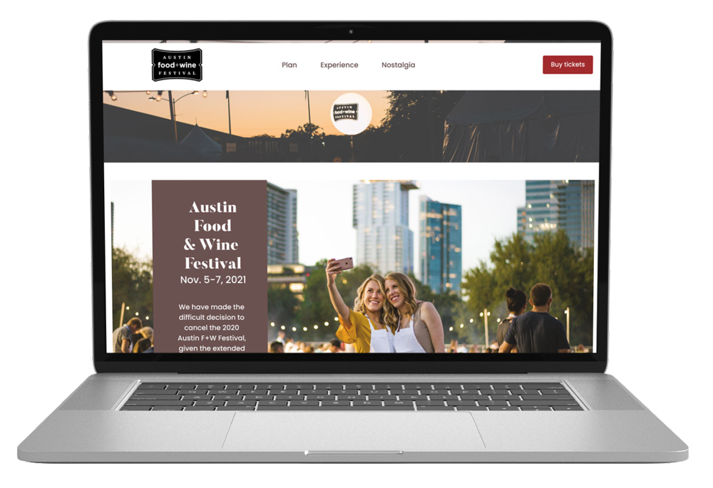
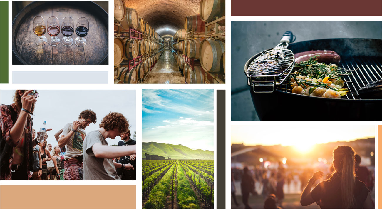
The original homepage has a wall of text on a beige background. The site’s original color palette was black, white, and red. Since one of the user’s needs was to document their festival experience, we decided to use the words nostalgia to guide our new color palette. We wanted to create a warm friendly vibe with a nostalgic feel, while also pulling colors from the wine itself and the oak barrels that it was aged in. We each made a mood board and felt that the one here best described a nostalgic friendly mood.
I implemented the ‘heart’ functions throughout the site.