Desiree Daniels
2 weeks
Drizzle + Shine is Seattle based brick & mortar eco-boutique for men and women’s apparel and accessories. They pride themselves on selling vegan items that are ethically sourced and use sustainable fabrication practices. Their customer currently must sift through several pages of merchandise to see if they sell specific items. The online boutique appears to be for women only, but upon looking through pages of merchandise it is clear that they also sell both men’s and unisex apparel.
Drizzle + Shine has organization and navigation challenges on their boutique website. Their global navigation system is vague and groups many items together that could be better categorized and easier to find.
I believe that by reorganizing the global navigation, sales would increase and the bounce rate would go down.
Research includes:
I began the project by setting up a screener looking for people who regularly shop online and who consider themselves to be ‘sustainable shoppers’. People who value sustainability and seek out these brands/resources.
I located 3 people who fit this profile out of 10 screeners.
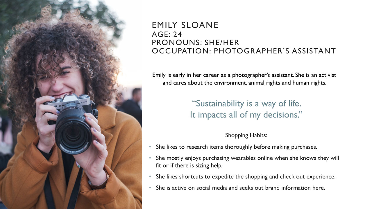
Emily is a representation of all of the sustainable shoppers that I interviewed. These are common desires amongst them:
The overall takeaway is the Emily likes to thoroughly research before she shops. She finds a lot of this information through social media and likes shopping to be quick and painless. This led me to investigate the competition.
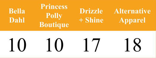
The task: To locate and purchase a skirt.
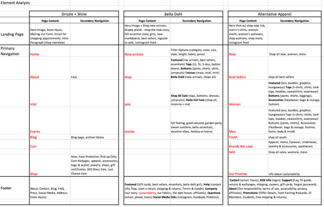
I assigned a simple task and tested this task on 3 competitor’s sites to see how Drizzle and Shine held up.
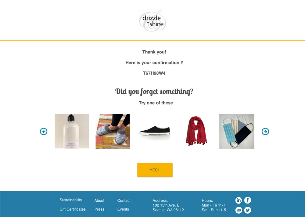
I found that two sites had this task completed in 10 steps. Drizzle and Shine showed up in a third-place with 17 steps. They lost speed in these three areas:
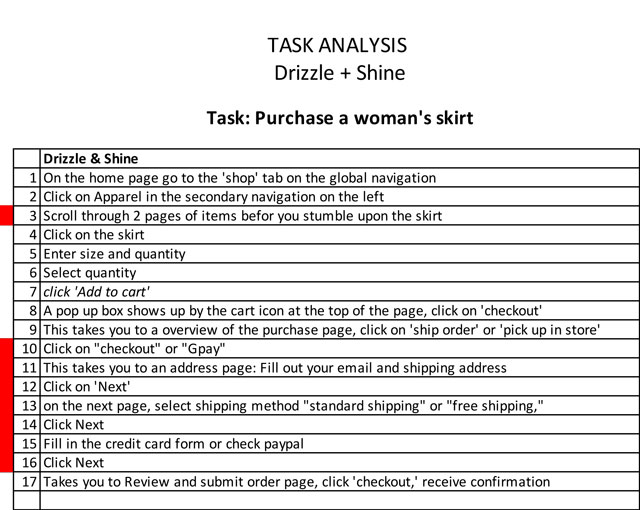

1. Global Navigation
2. The Check-Out Process
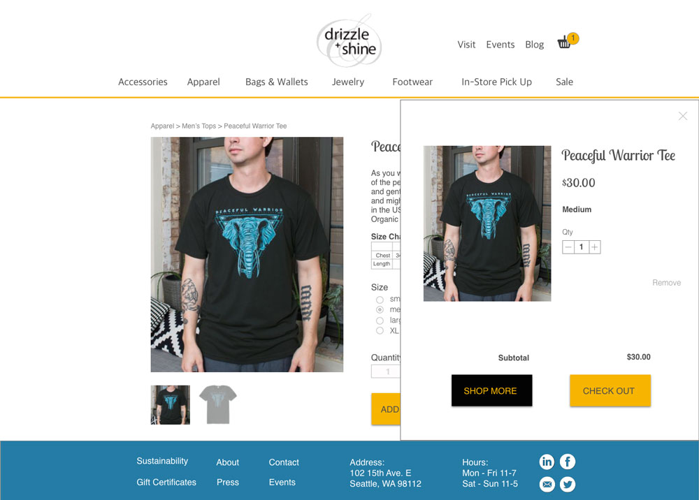
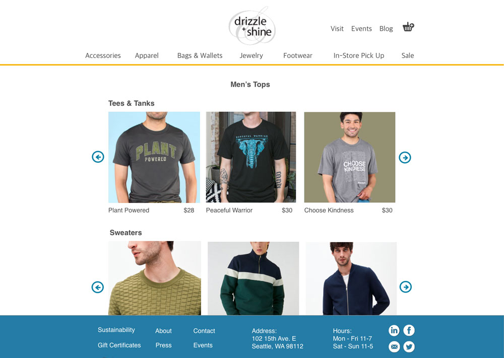
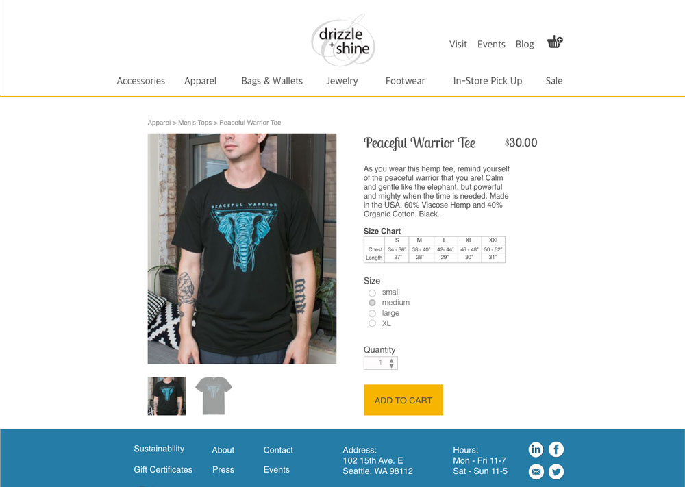
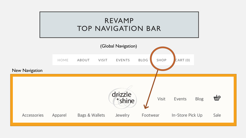
3. Lets Now Categorize Apparel by Gender & Item
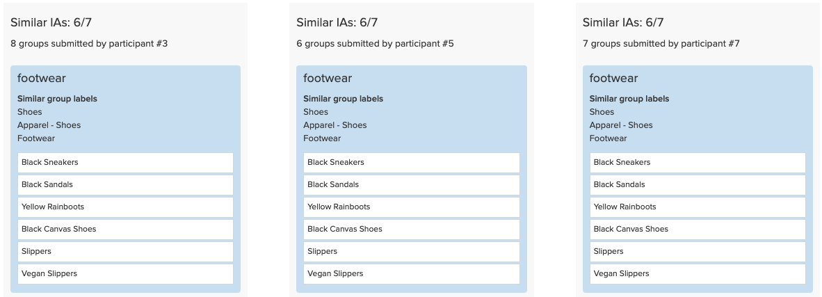
I identified that the following headers all worked except for shoes, which were changed to footwear. The outlier was slippers. It was not clear for all participants if slippers would be included in shoes or not.
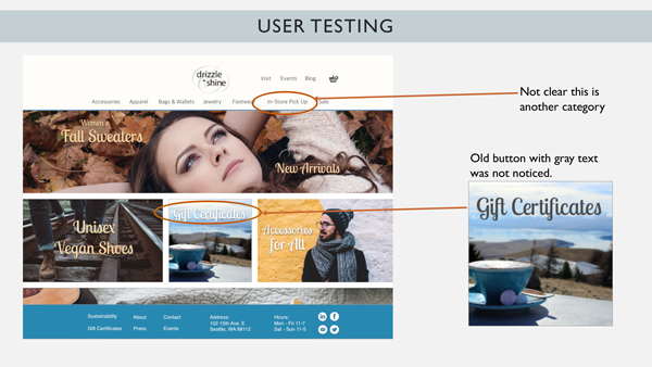
Findings: Sustainability was placed on the footer of the competitor’s sites. They did not draw attention to this as an important part of their brand, despite it being a positive distinction from the competition.
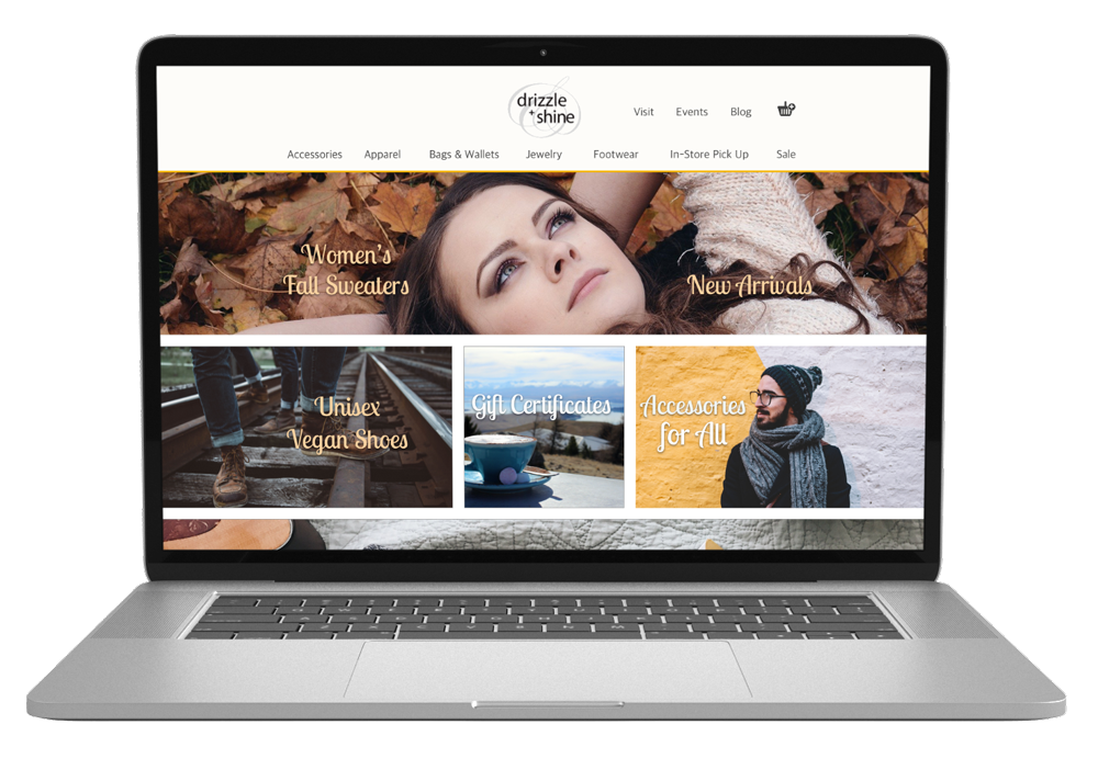
To improve upon this, I created shoppable “photo stories” on the front page with clickable headlines calling out sustainable categories, such as “Unisex Vegan Shoes.” These new headlines create intrigue while the photos entice the users to bypass the global navigation to begin shopping immediately.
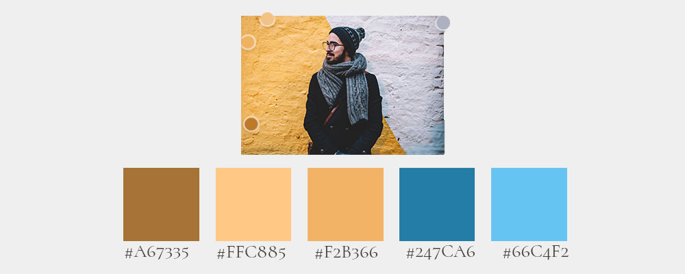
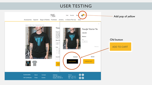
I chose the colors blue and yellow to represent rain and sun (Drizzle + Shine). I used the color yellow for all of the CTA button and cart items. This is a warm and bright color that highlights and prompts action. The blue is grounding as used as the footer and other highlights.
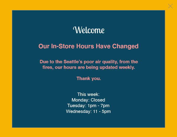
I redesigned the homepage using an Instagram feel with large dreamy photos and catchy category headlines that highlighted the sustainable brand highlights and that the store had men’s categories. I utilized the negative white space on the old home page and added a pop up to go over the new store hours due to the Seattle fires.

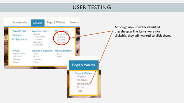
For the apparel category, I chose to use a slab drop-down menu because there were not enough items in each category to fill a page. I choose to group all women’s tops on one page using carousels to scroll back and forth. The dropdown menu had grayed out categories that were not clickable stating what was in each category. The users wanted to click on these, so the navigation needs more time put into it to redesign.